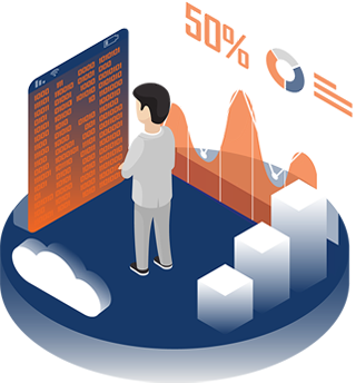
Data visualization is the graphical representation of information and data. By using visual elements like charts, graphs, and maps, data visualization tools provide an accessible way to see and understand trends, outliers, and patterns in data.

Benefit of Services
Common general types of data visualization:
- Charts
- Tables
- Graphs
- Maps
- Infographics
- Dashboards
Data visualization tools can create anything from simple pie graphs to complicated interactive choropleths. The trick is choosing one with all the right features.
What Each Includes?
A dashboard is a tool used for information management and business intelligence.
Advantages of Dashboards
Dashboards are valuable because they transform business data into critical information that jumps out to the user, who can then make sense and act on it immediately.
- Fast and effective decision-making – Gives executives, managers and analysts convenient immediate access to key performance metrics, which help them monitor performance and processes for a greater understanding of the business.
- On-demand, accurate and relevant information in line with business priorities – Dashboards clearly communicate business objectives throughout the organization and allow users to see progress towards those goals. This keeps everyone focused and informed. With a personalized layout, users only see the information that is most important to them, and they can filter out information that is not relevant.
- Focused identification of problems, inefficiencies, or negative trends for immediate action and improved performance. Users can immediately see any problems and drill down on charts and links to explore detailed information and analyze data in real-time, to determine root causes and to correct negative trends.
An infographic is a collection of imagery, charts, and minimal text that gives an easy-to-understand overview of a topic.
What are the different types of infographics that we offer?
- Statistical infographics
- Informational infographics
- Timeline infographics
- Process infographics
- Geographic infographics
- Comparison infographics
- Hierarchical infographics
- List infographics
- Resume infographics
Graphs and tables are visuals that show relationships between data and are intended to display the data in a way that is easy to understand and remember.
Graphs may be preferable to display certain types of data, while tablets are ideal for others.
Charts are tables, diagrams, or pictures that organize large amounts of data clearly and concisely.
Different types of graphs
- Line graph
- Bar graph
- Pictograph
- Histogram
- Area graph
- Scatter plot
Statistical tables can be classified under two general categories, namely, general tables and summary tables.
General tables contain a collection of detailed information including all that is relevant to the subject or theme.
The main purpose of such tables is to present all the information available on a certain problem in one place for easy reference and they are usually placed in the appendices of reports.
Summary tables are designed to serve some specific purposes. They are smaller in size than general tables, emphasize some aspect of data, and are generally incorporated within the text.
The summary tables are also called derivative tables because they are derived from the general tables. The information contained in the summary table aims at analysis and inference. Hence, they are also known as interpretative tables.
